


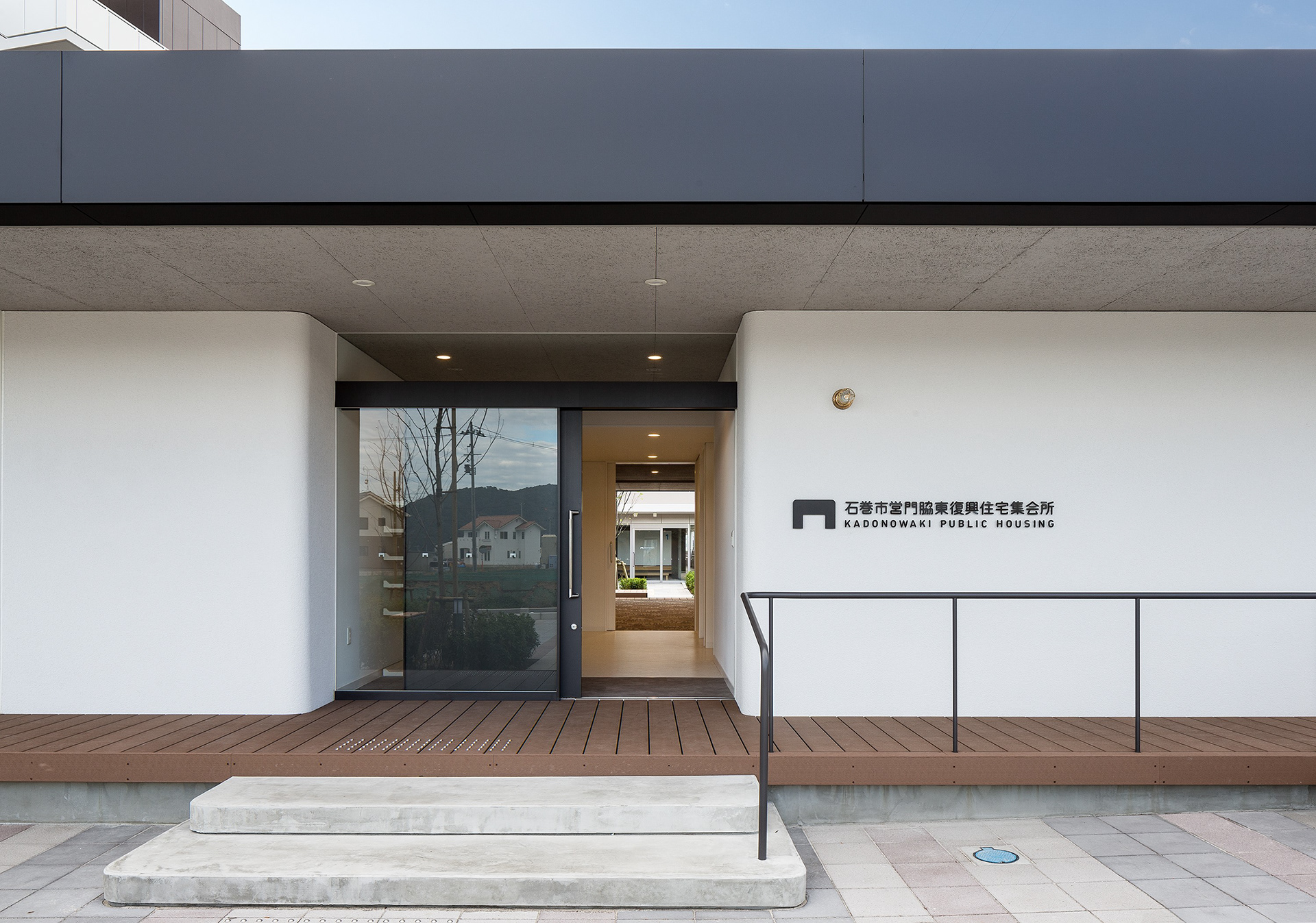


Exterior color design for the Kadonowaki public housing
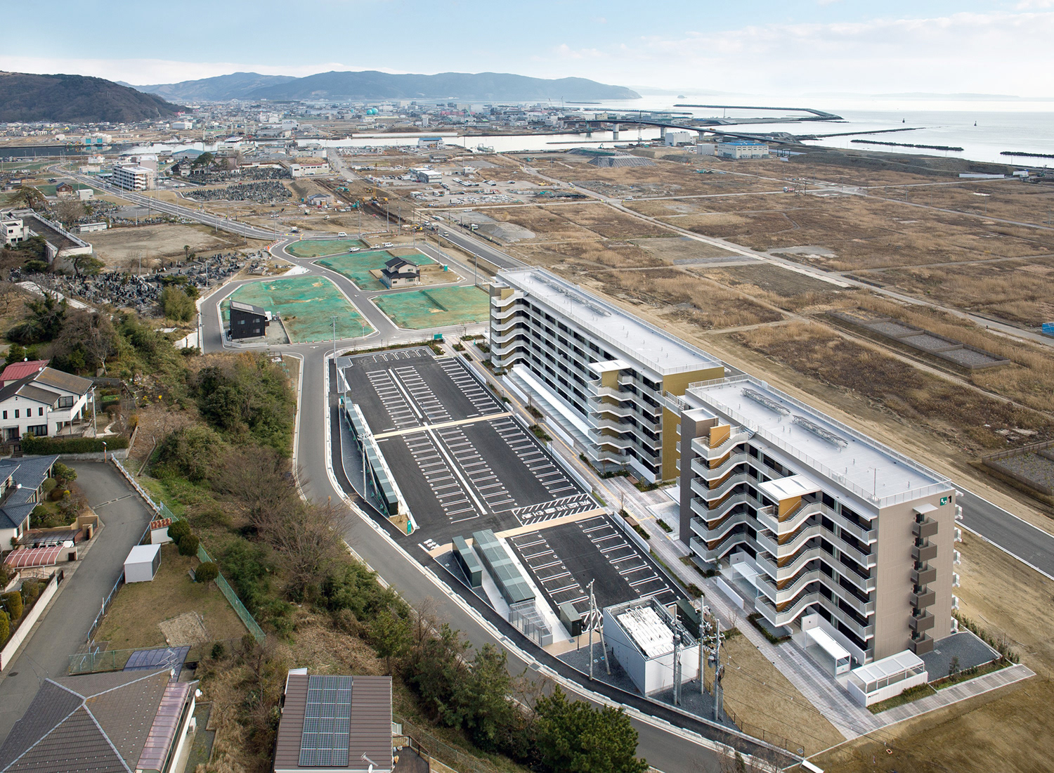
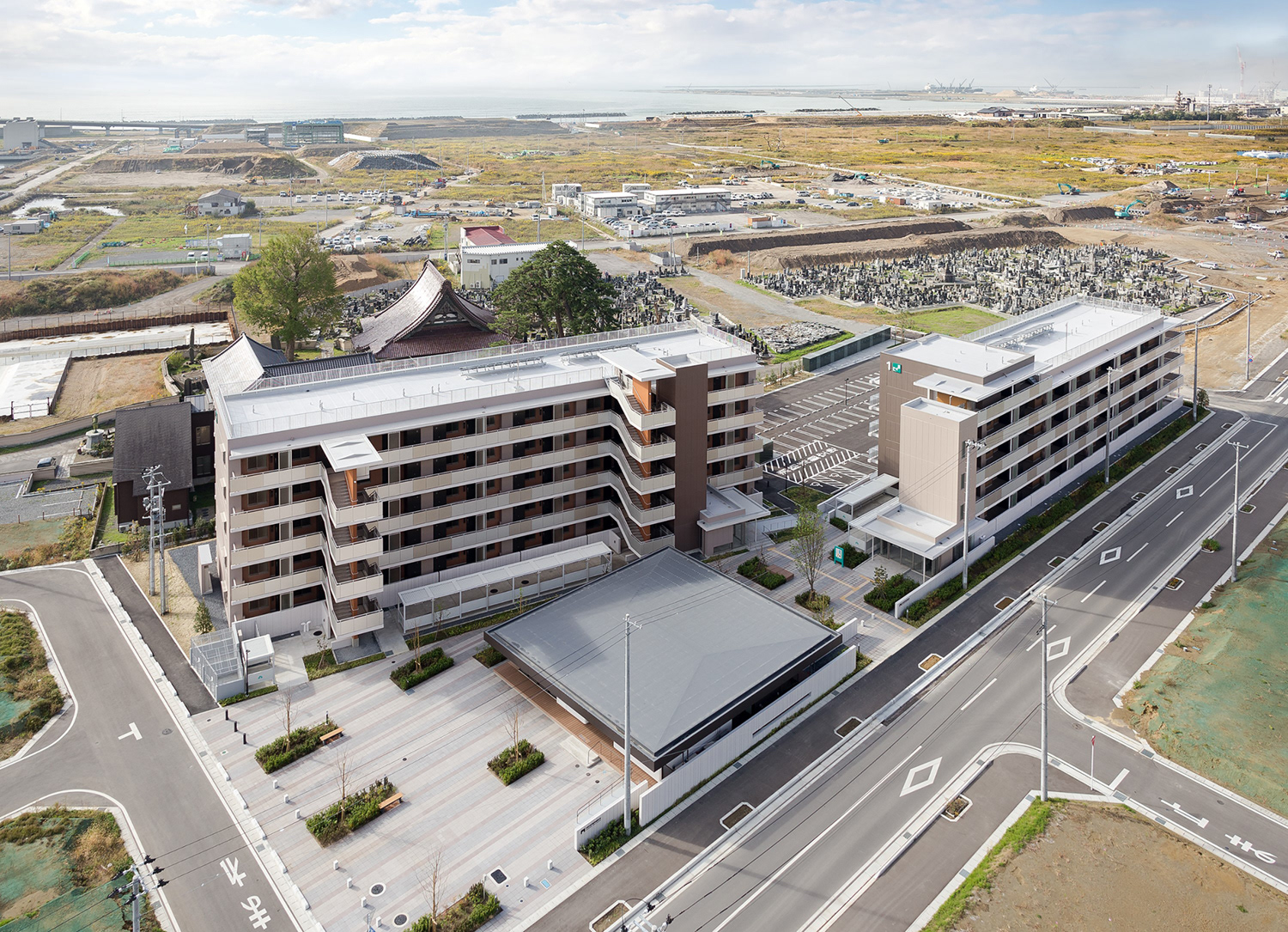
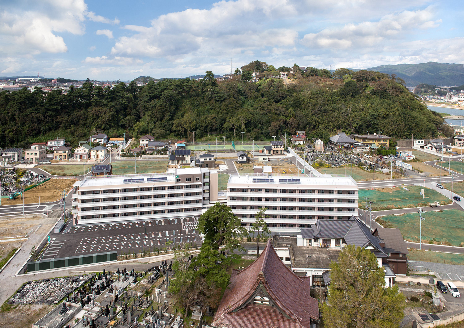
This is the color scheme project for 4 restoration houses in Kadonowaki district, Ishinomaki-city where got heavy damage by tsunami in 3.11, Great East Japan earthquake.
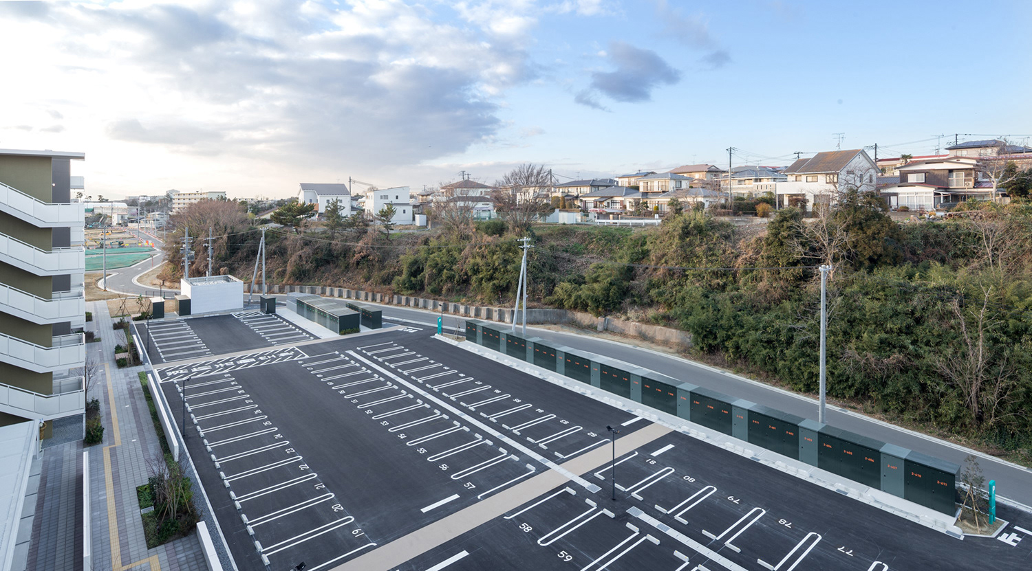
With consideration for surroundings environment focusing on Mt. Hiyoriyama which is familiar with neighborhood, we organized a clear color scheme as a symbol of the revival in this area.
Supposing new detached houses will be built, we needed to find the method to make harmony with new scenery. In this occasion, we would like these houses to be leading force and to provide this area regionally-oriented color pallet.
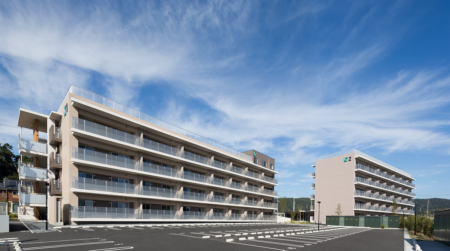
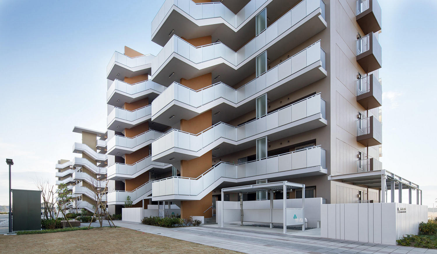
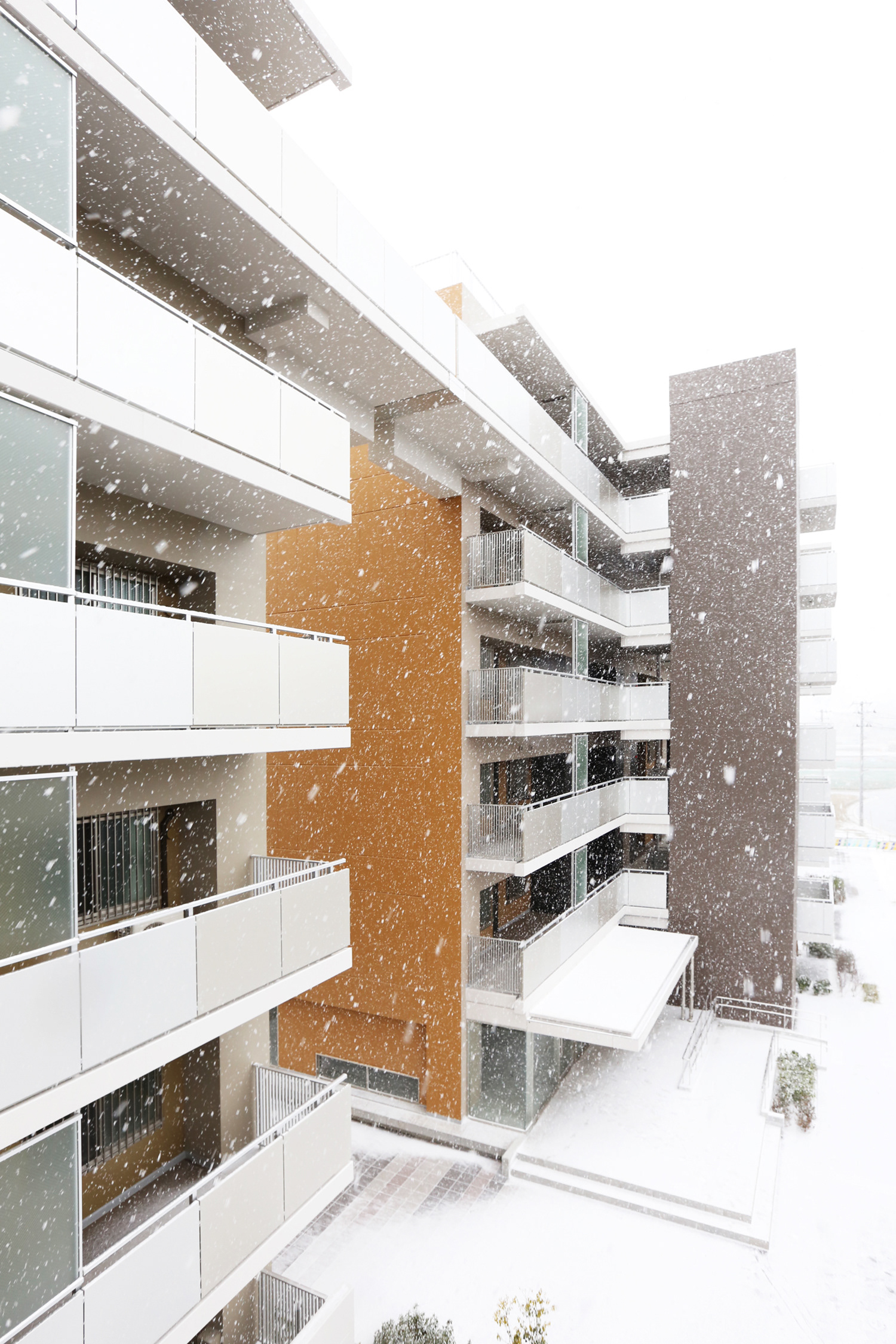
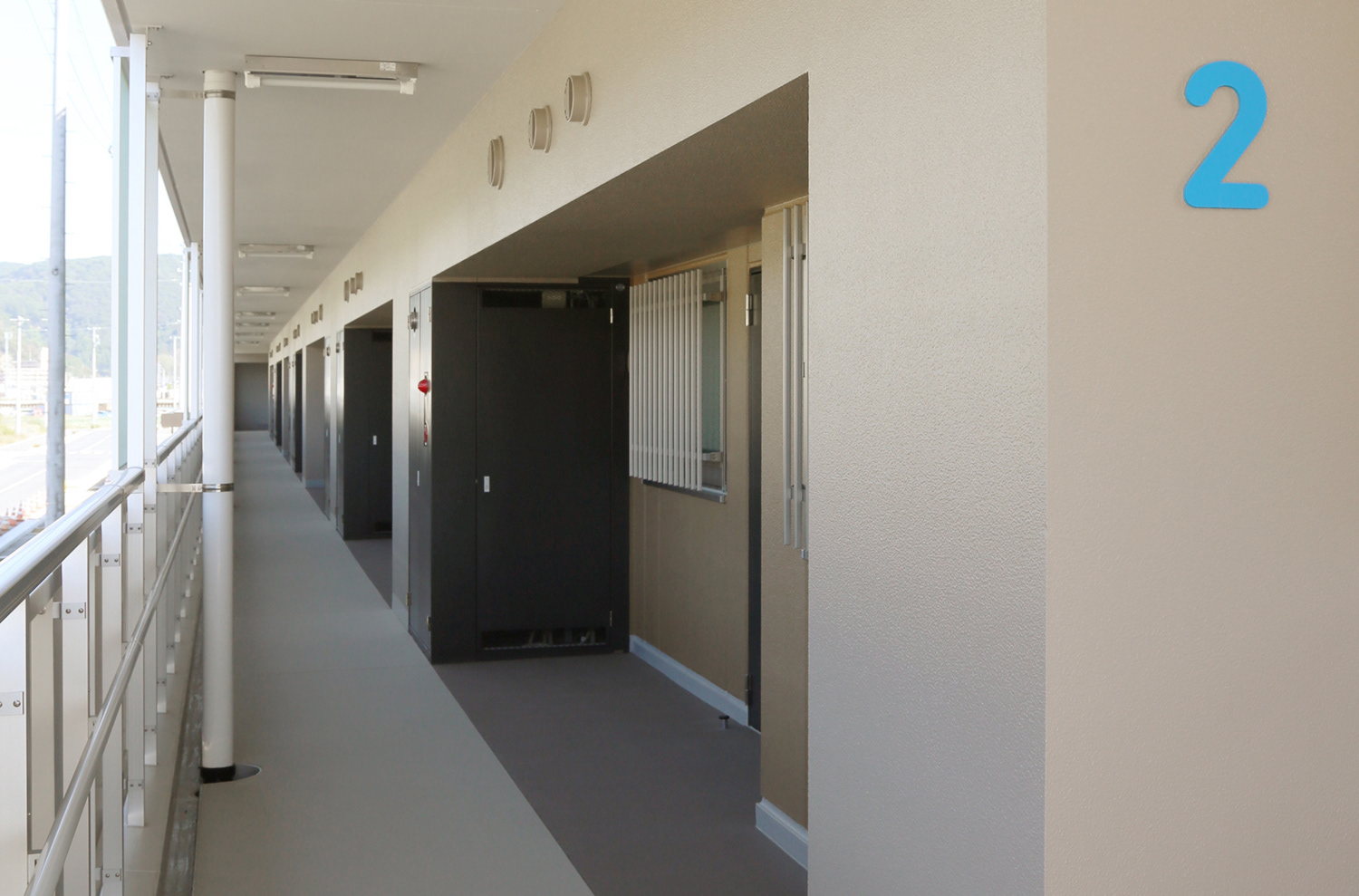
Using warm colors of middle brightness and low saturation for the predominant color, we tried to create a feeling of unity.
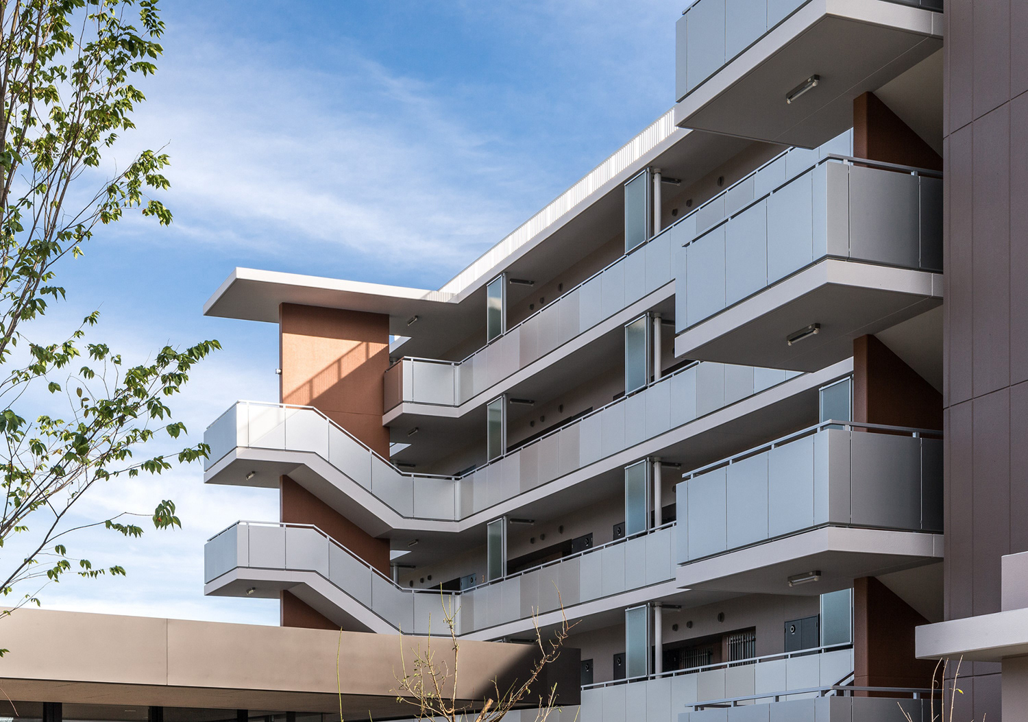
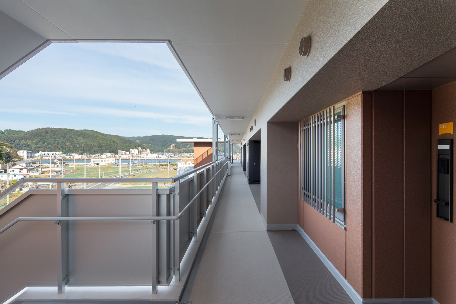
Meanwhile applying the colors which is suitable for housing and feelable calmness, to slab of balcony and the wall facing to the street as an accent, off-white color was adopted. It gives modern expression taking future of this area.
Grand Prize at the "GOOD PAINTING COLOR 2017"
—
2016 Ishinomaki, Miyagi Prefecture, Japan
Architecture & Landscape | Takenaka Corporation
Exterior Color Design | Teruhiro Kataoka/COTONA Inc.
Photo | Hiroyuki Oki/Blue Hours
2016 Ishinomaki, Miyagi Prefecture, Japan
Architecture & Landscape | Takenaka Corporation
Exterior Color Design | Teruhiro Kataoka/COTONA Inc.
Photo | Hiroyuki Oki/Blue Hours
門脇復興住宅 外装色彩計画
東日本大震災において、津波の甚大な被害を受けた石巻市門脇地区に建てられた、復興公営住宅4棟の配色計画である。地域住民に親しまれている日和山を中心とした周辺環境への配慮と共に、復興のシンボルとしての明快な配色計画を検討した。今後周囲に戸建住宅が立ち並ぶことを想定し、新しい街並みとの調和方法を模索する中で、本建物が牽引役として地域の風土に根ざした「カラーパレット」を提供したいと考えた。基調色には暖色系の中明度の低彩度色を展開し、計画地全体の統一感を図った。住宅にふさわしい落ち着きの感じられる配色を行う一方、バルコニーのスラブや沿道に面して立つアクセントウォールにはオフホワイトを使用し、地域の未来を担うモダンな表情を与えている。
"グッドペインティングカラー2017" 最優秀賞受賞
—
2016年 宮城県石巻市
建築・ランドスケープ設計監理 | 株式会社竹中工務店
外装色彩計画 | 片岡照博/株式会社コトナ
写真 | 沖裕之/Blue Hours
2016年 宮城県石巻市
建築・ランドスケープ設計監理 | 株式会社竹中工務店
外装色彩計画 | 片岡照博/株式会社コトナ
写真 | 沖裕之/Blue Hours